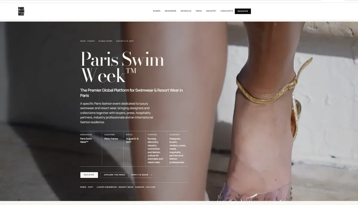
A website can be visually striking and still fail its users. If visitors cannot understand the offer, find the next step, read comfortably on mobile or complete a form without friction, visual sophistication becomes expensive decoration. Effective web design creates an experience that is both memorable and usable.
For ambitious organizations, the design challenge is to combine brand expression with clarity, consistency, accessibility and the practical realities of development. This guide presents a framework for making those decisions deliberately.
1. Design begins with the visitor’s questions
A homepage is not a company presentation. It is the first step in a visitor’s decision. Most visitors want to know four things: what the organization does, who it serves, why it is credible and what to do next.
Start with real audience situations rather than invented personas alone. A procurement lead comparing agencies needs delivery capability, relevant work and a straightforward contact route. An event attendee needs dates, locations and registration details. A prospective investor needs credibility, leadership and evidence. These visitors may share one website, but they do not share identical priorities.
Map the most important tasks and identify the information needed at each stage. Put high-priority answers where people naturally encounter them, and make deeper exploration available without forcing everyone through the same sequence.
2. Establish a clear visual hierarchy
Visual hierarchy is the way a design communicates what matters first. It comes from relationships between type size, weight, spacing, colour, layout and image placement—not simply from making every headline enormous.
A strong service homepage often follows this pattern:
- A concise statement of the value proposition.
- A brief explanation in straightforward language.
- One primary action and a lower-pressure secondary action.
- A clear overview of services or capabilities.
- Relevant examples or proof.
- A closing invitation to continue the conversation.
Headlines should communicate rather than merely create atmosphere. A phrase such as “Websites built for clarity, performance and growth” tells a visitor more than a vague promise that a brand is “redefining tomorrow.” Supporting text should elaborate on the promise, not repeat it in different words.
Use typography deliberately. One expressive display family combined with a highly legible body family is usually enough. Limit the number of weight and size combinations and test line lengths on wide screens. Readability depends on the entire composition, including how headings wrap and how closely supporting paragraphs follow them.
3. Use whitespace to create rhythm, not emptiness
Whitespace can signal confidence and help visitors distinguish ideas. But too much separation between a heading and its supporting text can fracture the story. Too little space between service cards can make distinct offerings feel unrelated.
Treat each section as a visual unit with a clear introduction, main content and intended next step. Use consistent content widths and edge margins throughout the site. Narrower text columns make long paragraphs easier to read; wider layouts suit image-led portfolios and comparative tables.
A controlled rhythm is often more premium than decorative complexity. For example, alternate a white introductory section, a soft-grey service section, a dark portfolio section and a white closing section. Ensure each transition supports content hierarchy rather than simply changing colour for novelty.
4. Build a reusable design system
A design system is more than a collection of buttons. It defines the recurring rules of a product: typography, spacing, colours, grids, interactive states, cards, form elements, imagery, motion and written interface language.
Start with a concise set of design tokens—such as spacing increments, type scale, neutral colour palette and border treatments. Document how components behave in normal, hover, focus, active, loading and error states. Include content conventions: how service titles are written, how dates are presented and whether actions use “Start a project” or “Contact us.”
A consistent system allows new pages to feel like members of the same website. It also reduces rework when an organization needs additional offerings, research articles or landing pages. Nielsen Norman Group notes that incorporating content standards into design systems improves collaboration and coherence between writers and interface designers.
5. Responsive design is a content decision
Responsive design is not shrinking the desktop view until it fits a phone. Mobile visitors may use different navigation patterns, shorter reading sessions, touch input and less reliable networks.
Prioritize content rather than hiding essential information. A complex two-column hero can become a single-column experience without losing its message. A six-card grid can become a readable vertical sequence. A project gallery can preserve complete screenshots instead of cropping away the interface details that make the work useful to examine.
Check real text wrapping at 320–390px widths as well as standard mobile, tablet and desktop viewports. Avoid fixed heights on content containers that include variable-length copy. Test landscape orientation and browser zoom; both expose assumptions made during desktop-only design.
6. Motion should communicate, not compete
Subtle interaction can make a site feel considered: a card responds when focused, a menu opens predictably, an image transitions gently on hover, or a progress indicator helps orient visitors. Motion can also distract, delay interaction and create accessibility problems when overused.
Use animation to explain relationships or confirm actions. Keep effects short and lightweight; avoid animating large page regions on every scroll event. Respect the prefers-reduced-motion media query and ensure that essential content is visible without animation. Hover-only navigation is inadequate on touchscreens and for keyboard users.
The best interaction design can be tested without a mouse: can a visitor tab through the site, understand focus, operate menus, pause motion and submit forms successfully?
7. Accessible design strengthens the whole experience
Accessibility requirements improve design discipline. Strong contrast helps in bright environments; meaningful headings improve scanning; explicit labels help everyone understand forms; consistent navigation reduces mental load.
The W3C’s WCAG 2.2 provides an established framework across perceivability, operability, understandability and robustness. Review colour contrast, focus visibility, keyboard sequence, heading structure, image alternatives and validation messages as part of the design process—not only at launch.
Accessibility cannot be certified solely by an automated score. Pair technical checks with human testing and editorial review, and document any known limitations before release.
8. Create a purposeful portfolio and proof system
For agencies and creative businesses, projects should demonstrate judgment as well as appearance. Show the actual interface clearly and describe the industry, problem, design direction and services involved. When you have verified metrics or client permissions, include them with context. Never invent conversion increases, revenue figures or endorsements to make an example sound more impressive.
A useful portfolio card includes a readable project title, a complete preview image, industry context and a clear route to explore the work. Make the entire card keyboard accessible and avoid decorative overlays that obscure essential information. The same approach applies to testimonials and case studies: show enough context for a reader to understand what is being demonstrated.
Review the presentation of the Shift Agency Projects portfolio for examples of image-led digital experiences across different industries.
9. Test design quality against real tasks
Design review should involve more than aesthetic preference. Ask participants to complete a few representative tasks: identify a relevant service, find a project example, locate pricing guidance and send a project inquiry. Observe where they hesitate and what they misunderstand.
Useful evaluation questions include whether the offer is understandable within seconds, whether headings are easy to scan, whether important actions are discoverable, whether text remains readable on mobile, and whether forms provide clear confirmation and error feedback.
Use analytics to identify pages and steps that deserve investigation; then use qualitative observation to understand why people behave as they do. A small number of targeted usability tests can reveal issues that a visual review misses.
10. Turn strong design into an adaptable system
Good design is not a fixed screenshot. It is a system capable of carrying new articles, services, campaigns, projects and content without sacrificing quality. The handoff between design and development must include responsive behavior, component states, content rules and accessibility considerations.
A website becomes genuinely premium when every page—from the hero to a legal notice or contact form—belongs to the same coherent experience. Distinctive art direction matters, but it succeeds only when paired with clarity and care.
Further reading
- W3C: WCAG 2.2
- Nielsen Norman Group: Content Standards in Design Systems
- Nielsen Norman Group: The Impact of Tone of Voice on Brand Perception
Building a new experience? Explore brand design, web development or discuss a project with Shift Agency.